Grid
Textile logic = circuit logic. PCB lines, runway grid, quantum weave. Overlay on photography at 8–12% — or motif demos like this card. Never page void or controls.
Presage NYC · NYFW 2026
v2 component library — website, interactive decks, social, and application.
Single token file ships to all surfaces. Set theme on <html> — dark is default; light uses chrome-hi void + solid smoke steps for legible tables and panels.
Agent build rules
.nx-snippet blocks only — do not invent classes..nx-link (#52b8ff + underline · both themes) · .nx-btn--primary (signal #ff4c00) · .nx-btn--secondary (slate + dust). Never green buttons.#00c98a — same both themes; snippet code uses #007a52 in light for legibility. Light = #e8e2dc void · #faf8f5 raised · solid smoke borders..nx-error = validation only..nx-tag--draft · --premier · --signal only. Motif names = .nx-stamp.components.css → live demo in §06 → scrollable snippet → row in snippet index below./assets/pins/ — not CGI.Import order: tokens.css → components.css → atmosphere.css when IR layers ship.
Quick apply
<html lang="en" data-theme="dark">
<link rel="stylesheet" href="/v2/tokens.css" />
<link rel="stylesheet" href="/v2/components.css" />
<!-- IR surfaces: /v2/atmosphere.css -->

<!-- Toggle: document.documentElement.setAttribute("data-theme", "light") -->| Token | Dark | Light | Use |
|---|---|---|---|
--nx-void | #000000 | #e8e2dc | Page background · warm off-white |
--nx-ground | #141312 | #faf8f5 | Raised panels, snippets, cards |
--nx-smoke-surface | #c4bbb3 | #d9d2ca | Draft labels + smoke fills in light |
--nx-border-strong | rgba(255,255,255,0.16) | rgba(28,25,22,0.26) | Tables, panels, snippets |
--nx-smoke | #c4bbb3 | #1c1916 | Primary text |
--nx-link | #52b8ff | #52b8ff | Underlined links · both themes |
--nx-matrix | #00c98a | #00c98a | Snippets, .nx-h3, mono UI accents |
--nx-ice | #52b8ff | #52b8ff | HUD cool accent · matches link · optional icon color |
--nx-vanilla | #f2ebe0 | #9a8e80 | Default icon color · warm cream on void |
--nx-icon-color | var(--nx-vanilla) | var(--nx-vanilla) | Decorative icons · search · empty state |
--nx-border | rgba(255,255,255,0.08) | rgba(28,25,22,0.1) | Outlines — inverted per theme |
--nx-signal | #ff4c00 | #ff4c00 | Primary button — unchanged on warm ground |
--nx-slate | #4c596b | #4c596b | Secondary button border · same both themes |
--nx-dust | #354656 | #354656 | Secondary hover fill · same both themes |
--nx-secondary-text | #a3b8cc | #354656 | Dark: dust-text on wash · light: dust on void |
--nx-secondary-bg | rgba(53,70,86,0.35) | transparent | Dark: dust wash · light: slate outline only |
--nx-infrared | #ff4c00 | #ff4c00 | HUD REC, accent pulse |
--nx-phosphor-hi | #00c98a | #00c98a | Tag text on bog fill · matches matrix |
data-theme | dark | light | Set on <html> |
data-icon-color | vanilla | ice | Icon palette · default vanilla |
Layout
| Token | Value | Use |
|---|---|---|
--nx-pad | clamp(1.25rem, 4vw, 2.5rem) | Column edge inset (shared hero · main · footer) |
--nx-content-max | 920px | Guide column max width |
--nx-rail-w | 0 → 8.5rem @1100px | Chapter nav reserve · left inset |
--nx-space-1…8 | 0.25rem → 3rem | Section + component gaps |
--nx-bar-h | 56px | Sticky header height |
600px | min-width | 2-col rules, theme previews |
700px | min-width | 2-col grids, type specimen meta |
900px | min-width | Hide mobile bottom nav |
1100px | min-width | Chapter rail visible |
Motion
| Token | Value | Use |
|---|---|---|
--nx-duration-fast | 150ms | Pressed feedback |
--nx-duration | 250ms | Buttons, links, panels |
--nx-duration-slow | 450ms | IR heat transition |
--nx-ease | cubic-bezier(0.22, 1, 0.36, 1) | Default easing |
prefers-reduced-motion | media query | Disables scan, shimmer, dither-adjacent animation |
Snippet index
Every shippable component documents copy-paste markup in a scrollable .nx-snippet. Planned components are listed without an ID until shipped.
| Component | Section | Snippet ID |
|---|---|---|
| Theme setup | 00 Foundations | #snippet-theme |
| Logo lockup | 03 Logo | #snippet-logo |
| Links + buttons | 04 Actions | #snippet-actions |
| IR frame | 05 Interaction | #snippet-ir-frame |
| Tags | 06 Components | #snippet-tags |
| Form + validation | 06 Components | #snippet-form |
| Search | 06 Components | #snippet-search |
| Empty state | 06 Components | #snippet-empty |
| Toast | 06 Components | #snippet-toast |
| Icon | 06 Components | #snippet-icon |
| Card | 06 Components | #snippet-card |
| Loader | 08 Loading | #snippet-loader |
| Modal / dialog | — | planned |
| Data table | — | planned |
Sampled from pins — bog green, slate + ice, chrome mist. Signal = primary (#ff4c00) · slate + dust = secondary · link = #52b8ff underline · matrix = #00c98a — same hex in both themes.
Icons default to vanilla cream — not link blue. Link stays #52b8ff both themes. Light mode = solid surface steps + strong borders — tables and panels must read clearly on void.
Three families only. Syne for display headlines · Instrument Sans for body · IBM Plex Mono for UI stamps. Max six words in Syne headlines.
Syne · display
The threshold is open.
Who you reach
What sponsors get
Your buyer is already at fashion week.
Instrument Sans · body
Body copy — 48ch max width. Photography carries the page; type stays quiet.
IBM Plex Mono · UI
In the room
● REC · NYFW · 3 or 9 Sep 2026 [in flux]
NEXUS · NEBULA NYC · N=400
Helper text and token names in tables.
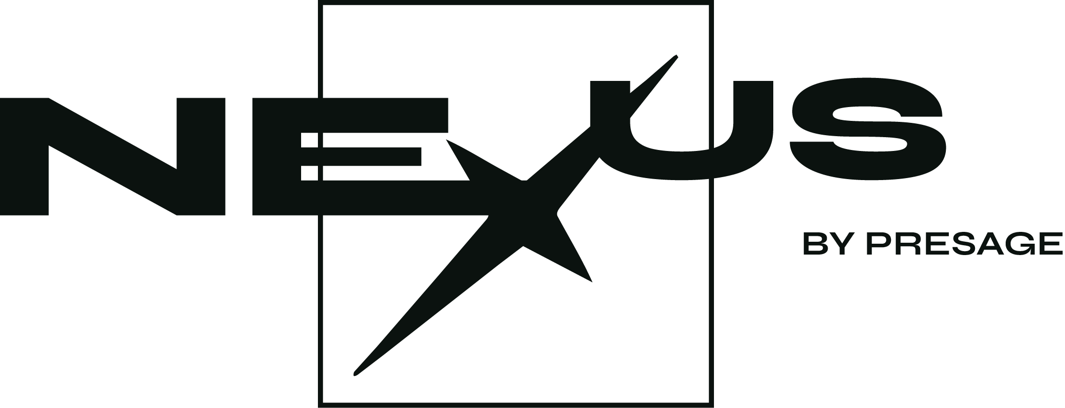
NEXUS + star X + square frame · BY PRESAGE tagline. Three approved PNG lockups — never rebuild in CSS or plain text.
Vanilla · dark void · bar + footer in dark mode
Signal · orange + green BY PRESAGE · hero · decks · marketing
Ink · light void · bar + footer in light mode
Hero · signal on dark · ink on light
Download: logo-nexus-signal.png · logo-nexus-vanilla.png · logo-nexus-ink.png · Min 32px digital height · never crop the square frame or star. Team rollout memo: LOGO-ROLLOUT.md.
<!-- Bar / footer · theme-aware PNG -->
<a class="nx-logo-mark" href="/" aria-label="NEXUS by Presage">
  <img class="nx-logo-mark__img nx-logo-mark__img--vanilla" src="/assets/logo-nexus-vanilla.png" alt="" />
  <img class="nx-logo-mark__img nx-logo-mark__img--ink" src="/assets/logo-nexus-ink.png" alt="" />
</a>

<!-- Hero · signal on dark · ink on light -->
<div class="nx-logo-hero" aria-label="NEXUS by Presage">
  <img class="nx-logo-hero__img nx-logo-hero__img--signal" src="/assets/logo-nexus-signal.png" alt="" />
  <img class="nx-logo-hero__img nx-logo-hero__img--ink" src="/assets/logo-nexus-ink.png" alt="" />
</div>

<!-- Deck close · signal lockup -->
<img src="/assets/logo-nexus-signal.png" alt="" style="max-width:20rem;height:auto" />Three actions only — link (#52b8ff underline), primary (signal #ff4c00), secondary (slate + dust). One primary per viewport.
| Class | Style | Use |
|---|---|---|
.nx-link | Underline · #52b8ff | Inline email, refs, nav — both themes |
.nx-btn--primary | Infrared · signal | Main CTA — book call, enter, submit |
.nx-btn--secondary | Slate border + dust fill | PPTX, copy, reset, preview toggles |
<a class="nx-link" href="mailto:partnerships@presagenyc.com">partnerships@presagenyc.com</a>

<a class="nx-btn nx-btn--primary" href="mailto:partnerships@presagenyc.com">Book the call →</a>
<button type="button" class="nx-btn nx-btn--secondary">Download PPTX</button>

<!-- Sizes: .nx-btn--sm · States: disabled, .is-loading -->44px touch targets · signal focus ring · FLIR heat + target boxes on imagery hover · 250ms easing · respect prefers-reduced-motion.
Button states
Hover primary for lighter signal · secondary fills dust · focus shows signal outline.
.nx-ir-frameFLIR-IR HUD stamp.atmosphere.css with tokens + components for IR layers.<!-- Requires atmosphere.css -->
<div class="nx-ir-frame">
<img class="nx-ir-frame__img" src="/assets/pins/chrome_ritual-11.jpg" alt="" />
<div class="nx-ir-frame__overlay" aria-hidden="true"></div>
<span class="nx-ir-frame__box nx-ir-frame__box--1" aria-hidden="true"></span>
<span class="nx-ir-frame__box nx-ir-frame__box--2" aria-hidden="true"></span>
<span class="nx-ir-frame__reticle" aria-hidden="true"></span>
</div>Forms, search, empty states, toasts, and icons ship in Components ↓.
Canonical UI patterns for app and web — tags, forms, search, empty states, toasts, and the on-brand icon set.
Labels & categories
.nx-tag — three categories only: Draft, Premier, Signal. Dark fill + bright text (Premier = bog + phosphor hi · Signal = signal-deep + signal). No other tag variants.
| Class | When | Never |
|---|---|---|
.nx-tag | Draft · Premier · Signal tier/status only | Custom labels, motif names, section titles |
.nx-h3 | In-page section title (matrix green, no fill) | Categories or filters |
.nx-eyebrow | Hero context row above headline | Card chips or table columns |
.nx-stamp | HUD corners, footers, timestamps | Interactive categories |
.nx-label | Form field labels only | Content taxonomy |
.nx-spec-label | Deck spec row keys (signal text) | App UI chips — use .nx-tag |
.nx-caption | Hints, table notes | Token/class names — use draft label in tables |
Variants
--draft · ground fill · muted text · WIP, unpublished--premier · bog fill · phosphor hi text · top tier--signal · signal-deep fill · signal text · tech persona tierTier slot · 1 remaining
<span class="nx-tag nx-tag--draft">Draft</span>
<span class="nx-tag nx-tag--premier">Premier</span>
<span class="nx-tag nx-tag--signal">Signal</span>
<div class="nx-tags">…</div>
Icon library
Sprite at /v2/icons.svg · default .nx-icon uses vanilla cream (--nx-icon-color) · switch to blue with data-icon-color="ice" on <html> · decorative icons get aria-hidden="true".
<!-- Default: vanilla via --nx-icon-color on <html data-icon-color="vanilla"> -->
<svg class="nx-icon" aria-hidden="true">
  <use href="/v2/icons.svg#nx-icon-search"/>
</svg>

<!-- Override per icon: .nx-icon--ice · .nx-icon--vanilla -->
<svg class="nx-icon nx-icon--ice" aria-hidden="true">
  <use href="/v2/icons.svg#nx-icon-info"/>
</svg>

<!-- Icon-only control: aria-label on button, not on svg -->
<button type="button" aria-label="Clear search">
  <svg class="nx-icon nx-icon--sm" aria-hidden="true">
    <use href="/v2/icons.svg#nx-icon-close"/>
  </svg>
</button>
Form
Signal focus ring on inputs and selects. Wire aria-invalid and aria-describedby to error copy.
<div class="nx-field">
  <label class="nx-label" for="email">Work email</label>
  <input class="nx-input" id="email" type="email" autocomplete="email" />
</div>

<div class="nx-field nx-field--error">
  <label class="nx-label" for="email-err">Work email</label>
  <input class="nx-input" id="email-err" type="email"
    aria-invalid="true" aria-describedby="email-err-msg" />
  <p class="nx-error" id="email-err-msg" role="alert">Enter a valid email.</p>
</div>

<div class="nx-field nx-field--success">
  <label class="nx-label" for="code">Access code</label>
  <input class="nx-input" id="code" type="text" aria-describedby="code-ok" />
  <p class="nx-success" id="code-ok">Code verified.</p>
</div>
Search
.nx-search · label via aria-label or visible .nx-label · results list is keyboard-focusable.
<label class="nx-label" for="q">Search sponsors</label>
<div class="nx-search">
  <svg class="nx-icon" aria-hidden="true"><use href="/v2/icons.svg#nx-icon-search"/></svg>
  <input class="nx-input" id="q" type="search"
    aria-controls="results" aria-expanded="false" />
  <button type="button" class="nx-search__clear" aria-label="Clear search">…</button>
</div>
<ul class="nx-search-results" id="results" role="listbox"></ul>
Empty state
Centered void · one vanilla icon (--nx-icon-color) · Syne title · single primary action.
No tiers yet
Premier slots open after the first partner call. Check back after NYFW week one.
<div class="nx-empty">
  <svg class="nx-empty__icon" aria-hidden="true">
    <use href="/v2/icons.svg#nx-icon-empty"/>
  </svg>
  <p class="nx-empty__title">No tiers yet</p>
  <p class="nx-empty__body">Premier slots open after the first partner call.</p>
  <div class="nx-empty__actions">
    <a class="nx-btn nx-btn--primary" href="mailto:…">Request deck</a>
  </div>
</div>
Toast
role="status" + aria-live="polite" on the region · signal = action confirm · ice = info · phosphor = success.
<div class="nx-toast-region" role="status" aria-live="polite">
  <div class="nx-toast nx-toast--signal">
    <svg class="nx-toast__icon" aria-hidden="true">…</svg>
    <div class="nx-toast__body">
      <p class="nx-toast__title">Inquiry queued</p>
      <p class="nx-toast__text">Partnerships will respond within one day.</p>
    </div>
    <button type="button" class="nx-toast__close" aria-label="Dismiss">…</button>
  </div>
</div>
Card
Raised surface · optional .nx-card--interactive · tag + body stack.
Tier slot · 1 remaining
<div class="nx-card nx-card--interactive">
  <span class="nx-tag nx-tag--premier">Premier</span>
  <p class="nx-body nx-body--primary">Tier slot · 1 remaining</p>
</div>Grid · mirror · quantum · code. Surveillance lives on imagery — FLIR heat, crosshair, target boxes — never as page void, button chrome, or wallpaper.
Grid
Textile logic = circuit logic. PCB lines, runway grid, quantum weave. Overlay on photography at 8–12% — or motif demos like this card. Never page void or controls.
Mirror
The mirror that thinks. Avatar · double · stained-glass screen. Split reflection, never carnival distortion.
Infrared
Thermal readout, REC stamp, crosshair corners. One orange pulse per layout — body against cold machine.
Code
specimen TH-07 :: mirror/avatar
status   veil.thinning = 0.94
alert    threshold.open()
Sapiens-style specimen IDs. Monospace metadata in one corner. Glitch only at threshold moments.
PCB
Thread as circuit. PCB traces, weave grids, runway floor logic. Allowed — never the whole page.
Target
Machine as equal in the atelier — portrait rigs, wireframe avatars, chrome limbs. Couture severity, not toy aisle.
Photography carries the page. Pins and venue stills only — mood boards live in v1.
IR frame
Pin inside .nx-ir-frame. Cold grayscale → FLIR heat on hover. Crosshair + target boxes. See Interaction.
Smoke wordmark
NEXUS lockup on void — signal, vanilla, or ink PNG only. Not on busy photography without a void plate. See Logo.
Dither strip
Bayer noise sliver — desktop right edge. Infrared-orange pixels, not purple static. Same in dark and light — no theme overrides. Requires dither-tone.js.
Pin photography
Curated refs in /assets/pins/. Deck breaks use /decks/assets/mood/ and /decks/assets/breaks/.
| Source | Path | Ship? |
|---|---|---|
| Pinterest pins | /assets/pins/ | Decks + guide heroes |
| Deck mood stills | /decks/assets/mood/ | Per-deck HTML only |
| Nebula venue | /assets/space/ | v1 Nebula section |
| Generated CGI scans | — | Do not ship |
Decorative full-bleed: alt="" when prose carries meaning. Informational crops: describe subject in alt text.
Threshold entry for immersive surfaces; skeleton + spinner for app and deck data fetches.
Page enter
Scroll to enter · brand guide
Skeleton · inline spinner
<div class="nx-loader-page" role="status" aria-live="polite">
  <div class="nx-loader-count">047</div>
  <div class="nx-loader-bar"><span></span></div>
</div>

<div class="nx-skeleton nx-skeleton--card"></div>
<div class="nx-skeleton nx-skeleton--line"></div>
<span class="nx-spinner" role="status" aria-label="Loading"></span>Desktop: chapter rail + full-bleed hero. Mobile: bottom nav + sticky bar. Photography leads; HUD stamps stay in corners.
.nx-bar · min-height 56px · blur backdrop.nx-mobile-navScroll-native HTML decks — partnership, signal, mirror. Spec rows for facts; mood imagery from pins; sticky CTA bar on all viewports.
In the room
| Deck | Path | CTA subject |
|---|---|---|
| Partnership | /decks/partnership | Sponsorship overview |
| Signal | /decks/signal | Technology sponsorship |
| Mirror | /decks/mirror | Presenting partner |
| Designer | /decks/designer | Designer participation |
Portrait booth, guest check-in, sponsor dashboard — same tokens, tighter density, skeleton-first loading.
Portrait lab · specimen TH-07
Your look
App patterns
Tier slot · Premier · 1 remaining
Use .nx-input + .nx-btn--primary full-width on mobile. Tab bar: ice active indicator, 44px height.
Shipped patterns only — documented components in v2, not a separate Figma kit.
| Pair (dark unless noted) | Ratio | AA body (4.5:1) |
|---|---|---|
| Smoke on void | 11.11:1 | Pass |
| Link blue on void | 9.66:1 | Pass |
| Link blue on warm void (light) | 1.69:1 | Underline required · same hex both themes |
| Matrix green on ground | 8.59:1 | Pass · snippets, .nx-h3 |
| Void text on signal button | 6.29:1 | Pass |
| Smoke on warm void (light) | 14.76:1 | Pass |
| Void text on signal (both themes) | 6.29:1 | Pass |
Shipped
--nx-touch 44px minimum.nx-skip link to #mainprefers-reduced-motion disables scan + shimmerdata-theme + color-scheme on htmlaria-pressed on theme + icon color togglesaria-invalid + role="alert" on errorsrole="status" + aria-live="polite"aria-hidden when decorative; label on icon-only controlsaria-label · aria-expanded on results.nx-tag variants only — no accent-class tintingNot in v2 yet
Always
#52b8ff · matrix #00c98a · signal primary · slate + dust secondary — unchanged across themesNever
Social marketing
1080×1920 stories · one REC stamp · one infrared element · Syne headline max 6 words.
Identity, rewritten in light.
Nebula NYC · N=400
Story checklist
logo-nexus-signal.png